An organization is recognized not only by reputation but also by its symbol. A symbolic icon which embodies the aspirations and principles of a specific sect, group, or business is commonly known as a logo. It can look dull and straightforward, but when scrutinized, you can infer an underlying meaning from its crucial components.
Strategic planning as to where logos should appear is always on the list. It can be through flyers, brochures, newspaper, TV ads, and others. You often see these logos at the entrance doors of business establishments. Where logos should be is important, but the logo in itself is more crucial before making it known as your company’s identity.
If you are planning to device an effective logo for your organization, you should consider knowing its vital components. Here are six (6) essential considerations on how to achieve a well-designed logo.
1. Content
There are three categories to consider when choosing the material of your logo design. It can be in the form of symbols, fonts or illustrations. This component of your logo design will serve as the base.
• Symbols/emblems – these include practically anything that can be used to symbolize something. Meaning, these are things that can directly describe a specific virtue. For instance, a handshake symbolizes unity or friendship. A globe can convey being globally competitive.
There are a variety of possible symbols to choose. It only takes a bit of your imagination and creativity to connect it with your organization’s values. You can also seek assistance from artists. Graphic artists or multimedia artists are usually the ones who are adept in designing logos and other artistic designs.
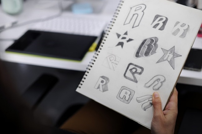
• Fonts – these are merely letters. Considering the variety of fonts available online, using fonts as a logo is common. Most companies prefer using name initials to emphasize their identity. Some find it compelling, but not all designers agree with it.
• Illustrations/pictures – these refer to any customized drawing with the intention to incorporate both symbols and fonts. The advantage of using images is its strong appeal to your audience. It has more details and has a more explicit message.
2. Meaning
A logo is nothing without its powerful sense. The content draws its ideas from the “meaning.” In other words, the mission, vision, goals, and values of the organization will change into symbols, fonts, and illustrations: the better the interpretation, the more likely for your logo to be as effective as expected. Because of that, designing logos can be quite delicate and time-consuming.
Another consideration also includes copyright. You must ensure that your design is authentic. Please mind comparing your logo to existing logos. Though this, you will be able to assess what needs to be changed and improved. It, therefore, keeps you away from possible trouble.
3. Color
Color plays an essential part in designing your logo. It is equally significant among other components. Moreover, it adds life to your design and makes it more attractive to observers. Poor color choice and lack of research might get you into trouble moving forward.
Also, consider critical issues when choosing what colors to render into your logo design. One of these is culture. Culture is a sensitive societal norm — for example, sexuality, religion, political norm, etc. When their culture is affected in any way, some sects and groups will file lawsuits, even bloodbath among tribes.
4. Depth
Its simplicity and complexity characterize the extent of your design. A sophisticated design can overpower other components, thus, making it ineffective. On the other hand, a simple logo is usually the most balanced designed. It highlights the content and makes the color more appealing.
5. Form
Your logo’s form or style provides an additional class to your overall design. Every curve and every edge is crucial. If you want your design to be more masculine, use an edgy style. But if you love feminine themes, use the curvy method. You can also incorporate both forms to create a variation and avoid monotony.
6. Consistency
Being consistent about your design sums it all. It should be in one harmony from the content down to the form. Meaning, the concept must manifest linearly. Some artists find it difficult at first but over time, with practice, designing with consistency becomes a piece of cake.
Takeaway
Choosing the design of your business logo has to be considered based on standards. Guidelines are available for designers to look upon when designing a logo. Hence, there are six (6) significant factors to consider when making a well-designed logo. Namely, content, meaning, color, depth, form, and consistency. Remember that these components characterize effective design. You can tap any web design agencies such as shield CO Metal Signs to help you out in designing an effective logo.


